Below are the external panels of my Digipak
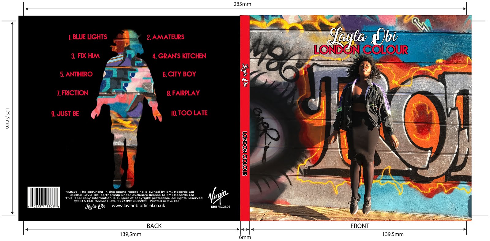
Left is the back of the album and to the right is the front
Below are the internal panels of our Digipak

Click on the image below to be directed to our website

Wednesday, 25 January 2017
Closing Post
This blog is now closed and I will no longer be posting. I hope that you enjoy reading my blog!
Monday, 9 January 2017
Evaluation Question 1: In what ways does your media product use, develop or challenge forms and conventions of real media products?
We have created a Music Video that largely follows forms and conventions, however, we have also disregarded some of these rules in order to create a Music Video that appeared different and therefore more exciting.
Music Video Conventions
The following theorists have developed their own lists of theories for music videos, and I have evaluated how we used them...

 This Gif shows our character falling asleep and entering the 'dream sequence'. We are then immediately brought back to the studio narrative through a dissolve. This is an example of when the narrative does not necessarily appear in a linear fashion. We were inspired by songs such as Runaway Love by Ludacris ft Mary J Blige as they fuse many different narratives together, depending on what area of the lyrics that they are on.
Vernallis' theories have been developed within many music videos. For example in the music video for the song Rather Be by Clean Bandit they use very rapid cuts. This helps to create pace in the video as well as bringing the editing into the foreground. We also decided to use this technique as it was an interesting way to create a variation of shot types.
Another example of how we exaggerated our editing was through our choices in grading. We decided to make our colours appear brighter and more saturated as this is usual to music videos and helps to connote youth and energy. Hard Time by Seinabo Sey is an example of a song that uses colours and grading effectively
Below is an example of when we used camera movement in order to reflect the mood of the song in order to follow convention. We were inspired by music videos such as Every Little Word by MNEK as we felt that the use of tracks were very effective.

Below are some examples of where we have developed Firth's theories...
 Narrative is a key element of many different types of music videos, especially those in the genre of R&B/Neo-Soul as they usually tell a story.This Gif shows the end of our story in which the male protagonist is shot, however, when he wakes up he is back on the train and realises that it was all a dream (hence his confused and frightened facial expression).
An example of our use of visual imagery through our use of sign language.


Neo-Soul/R&B conventions
R&B Conventions:
Although our video doesn't explicitly represent this ultra powerful and masculine manner, the fact that the entirety of the song is sung by an independent female Artist brings about a sense of power in itself as she is able to control what the audience sees or hears.
Neo-Soul Conventions:
Album Cover Conventions
Whilst researching real album covers we discovered that the main conventions consisted of the following...

In response to these conventions we developed our Album Cover in the following manner...

We broke convention through our inner panels by using a different colour scheme to the outside panels. We did this in order to create an striking contrast between the exterior and interior. Although we still wanted to stick to the idea of Graffiti, we decided to do this in a much simpler way through the use of hand drawn doodles and a very minimalist colour scheme. Rather than following convention and simply including more written information on our interior panel, we decided that this would be a good opportunity to add more images of our artist instead in order to develop her brand image.
In conclusion, I have learnt that it was important for us to follow some conventions in order to fulfill our audience's expectations, however, this should not hinder you from experimenting with your creativity as occasionally straying from convention makes for interesting and conceptual decisions. I think that this is especially important for a debut single, as it allows the artist to effectively convey their image and stand out in a very saturated industry.
Music Video Conventions
The following theorists have developed their own lists of theories for music videos, and I have evaluated how we used them...
 This Gif shows our character falling asleep and entering the 'dream sequence'. We are then immediately brought back to the studio narrative through a dissolve. This is an example of when the narrative does not necessarily appear in a linear fashion. We were inspired by songs such as Runaway Love by Ludacris ft Mary J Blige as they fuse many different narratives together, depending on what area of the lyrics that they are on.
Vernallis' theories have been developed within many music videos. For example in the music video for the song Rather Be by Clean Bandit they use very rapid cuts. This helps to create pace in the video as well as bringing the editing into the foreground. We also decided to use this technique as it was an interesting way to create a variation of shot types.
 |
| Rather Be fast pace editing |
 |
| Our fast paced editing |
 |
| Our use of bright colours |
 |
| Conventional bright grading |
 |
| Our use of slow camera movement to create a somber atmosphere |
 |
| MNEK's more upbeat use of camera movement |
 Narrative is a key element of many different types of music videos, especially those in the genre of R&B/Neo-Soul as they usually tell a story.This Gif shows the end of our story in which the male protagonist is shot, however, when he wakes up he is back on the train and realises that it was all a dream (hence his confused and frightened facial expression).
An example of our use of visual imagery through our use of sign language.

Our use of fairy lights in order to link visuals to the lyrics.
 |
| The aforementioned Mob Deep reference |
Voyeuristic shots are expected in music videos and representatives of an artist often establish a minimum amount of beauty shots that would be accepted. This highlights the importance of these types of shots as they give an artist an opportunity to develop their image. It also gives an opportunity for the video to further develop convention as it follows the male gaze.
 |
| One of our voyeuristic shots |
 |
| Voyeuristic shot from the song Lips Are Moving by Meghan Trainor |
R&B Conventions:
- Depicts strong and powerful women. In contrast to other genres such as Hip Hop, women are often depicted in a strong and powerful manner. However, one thing that I have noticed is the genre's tendency to make their artist appear more masculine in order to be seen as more powerful. For example, in the examples that I have chosen, Beyonce takes on the role of a Police Officer which is a role usually associated with men, whilst Ciara is dressed in very masculine clothing. Although this is a stereotypical representation, it is a good example of how men are seen as powerful.
 |
| Beyonce in her song 'If I was a Boy' |
 |
| Ciara in her song 'Like a boy' |
Although our video doesn't explicitly represent this ultra powerful and masculine manner, the fact that the entirety of the song is sung by an independent female Artist brings about a sense of power in itself as she is able to control what the audience sees or hears.
 |
| An example of our artist controlling the audience's attention by speaking directly to them |
- Majority of artists are female. Artists such as Erykah Badu and Lauryn Hill have dominated this genre, therefore, we thought it would be appropriate to follow convention and have a female artist in order to continue to the role of strong female icons.
- Lyrics often speak on person and political issues. For example, Laury Hill's song 'Zion' speaks of the industry's backlash on her for deciding to keep her baby at the peak of her career...
Our music video followed convention by choosing a song which had a very apparent political message. It commented on the issues between Police officials and Civilians, informing listeners of problems that they may be able to relate to...
Website Conventions
Album Cover Conventions
Whilst researching real album covers we discovered that the main conventions consisted of the following...

In response to these conventions we developed our Album Cover in the following manner...

We broke convention through our inner panels by using a different colour scheme to the outside panels. We did this in order to create an striking contrast between the exterior and interior. Although we still wanted to stick to the idea of Graffiti, we decided to do this in a much simpler way through the use of hand drawn doodles and a very minimalist colour scheme. Rather than following convention and simply including more written information on our interior panel, we decided that this would be a good opportunity to add more images of our artist instead in order to develop her brand image.
 |
| The inner panels of our Digipak |
Evaluation Question 2: How effective is the combination of your main product and ancillary texts?
We made all 3 of our media products, (our music video, website and album cover) with the intent to combine them in order to create an effective marketing campaign which would appeal to our target audience. To achieve this, It was important for us to create a feeling of synergy across our campaign so that the branding of our artist, Layla Obi, was made very apparent.
Ella Eyre's marketing campaign was very influential to us as we felt that it effectively created synergy across all of its different media products. Below I have given some examples of how it achieved this...

I have then created a slide show which explores the different decisions that we have made in order to make a synergistic campaign...
These synergistic elements meant that all of our products successfully advertised each other. Our Website advertised our Music Video which ultimately advertised our Album.
Richard Dyer's Star Theory
Richard Dyer is a theorist who's theories on the Music industry and culture have been respected largely. Below I have detailed his theories and how we followed/ went against them...(please view this mind map in full screen mode by clicking on the double ended arrow on the bottom right corner).
Mind Map created by Olamide Ajisafe with GoConqr
In conclusion, I think that the combination of our main and ancillary texts were very effective as the synergistic elements included within each made for a consistent brand image that will ultimate appeal to our TA.
Evaluation Question 3: What have you learned from your audience feedback?
When creating any media product it is important to listen to the advice/concerns of your TA as they are ultimately the consumers that you will be targeting.
Uses and Gratifications
As we were creating products aimed directly at a TA, it was important that we covered all of their requirements as audience members. Many theorists such as Richard Dyer have commented on the audience's reasons for consumption. Below I have included a Prezi detailing different audience needs and how we fulfilled them...
Our Feedback
Analytics
Youtube has a very useful feature which allows users that have uploaded to the site the ability to break down their viewers in terms of age, gender and country of residence. This was a very helpful function as it meant that we were able to analyse how our video appealed to our TA based on who had watched it.
From this information we found out that roughly 3/4 of our viewers were female. Although we wanted to create an artist that appealed equally to both genders, I am not surprised by this result as it is more likely for females to watch videos with strong female roles as they are able to relate to the figure.
Our results also showed us that 97% of our views were from the UK. This was a great finding as it proved that our video was appealing to our primary TA of people living in the UK.
In order to collect more in depth information we conducted a questionnaire through the site SurveyMonkey.com. Here are some of the results that we got...


I also decided to get more feedback by broadcasting our video via Whatsapp. Whatsapp made this very easy to do due to users having the ability to send out direct links to content (as seen above). This meant that I could also get feedback in a non-professional manner, encouraging people to give their honest opinions in a less pressured manner. The group chat that can be seen above consists of members of our TA aged 16-25. The feedback given to me was overwhelmingly positive and made me confident in the products that I had created. This direct approach was also a very efficient way to get constructive criticism. For example, in the screenshot below I ask my friend Narina for her honest opinion on our video and whether there was anything that she'd change. She immediately replied with in depth feedback and even filmed an extract to illustrate her point, once again highlighting the importance of visuals when attempting to translate ideas.
This in depth feedback picked upon issues that had been seen by multiple members of our TA. For example, both Narina and Eridona picked up on the unsteady camera work at certain points within our video. This confirmed issues that we as group members also had with our video and confirmed our fear that the shaky camera movement had hindered the audience's ability to fully submerge themselves in our video at some points as they became that they were watching an unprofessional project. Had I the opportunity to do this project again, I would improve how smooth our camera work was in order to heighten our audience's ability to lose themselves in the video and use it is a form of escapism as suggested by Richard Dyer. Overall our feedback was very positive as people appreciated the hard work that went into our workshop and thought that it paid off.
In terms of feedback for our website I decided to conduct a small focus group in which I got my fellow peers (and therefore members of our TA) to use our site and see how they went. This brought to light issues such as links that did not work which were easily rectifiable. It also helped us to improve the accessibility of our site. For example, a member of our TA said "I wish the 'Live' page was called something else because its not very clear". In response to this I then changed the name of this page to 'Tour Dates' to ensure all members of our TA could easily find their way around the site.

TA members also commented on the use of colour within our site, saying that they thought that "It looked really cool" and that "It looked professional". They also said that our use of a video as a background was "unique" and helped our website to stand out in an "artistic" way. One piece of criticism that we received was in regards to our merchandise as I was told that it did not provide enough of a variety. If I were to do this project again I would create a larger option of pieces in order to fulfill all of my TA's needs. Overall, feedback for our website was very positive as all 10 people answered yes when asked the question "Do you think that the website is effective and entertaining?".
For feedback on our Album Cover I once again conducted a small focus group. This group consisted of members of our TA who were shown our album cover and then asked to answer a series of questions. This session brought to light issues of clarity concerning our cover. For example, originally the track listing of our song appeared "awkward" and "even", however, thanks to this feedback we were then able to fix this. Another thing that we changed due to audience feedback was our use of colour. In an earlier version of our album cover all of our writing was in a bright green colour, but after hearing the feedback from our TA we decided to change this to a bold red. I think that this was a very beneficial decision as its bold red colour now fits into the bright graffiti aesthetic. As well as this, the colour red is once that we have used throughout our campaign such as in our video and on our website, thus creating another synergistic element and further developing our brand image.
Overall, feedback was very positive for our album cover as people felt that the mid-air pose of our artist was "amazing". They appeared to understand and appreciate the Graffitti theme, leaving comments such as "I like the bright colours". I was very happy with these results as were my TA members as they gave our cover an average of 8.5/10.
To conclude, gaining feedback from our audience members has been invaluable for us as it has given us an insight into the mind of members of our TA.
Uses and Gratifications
As we were creating products aimed directly at a TA, it was important that we covered all of their requirements as audience members. Many theorists such as Richard Dyer have commented on the audience's reasons for consumption. Below I have included a Prezi detailing different audience needs and how we fulfilled them...
Our Feedback
Analytics
Youtube has a very useful feature which allows users that have uploaded to the site the ability to break down their viewers in terms of age, gender and country of residence. This was a very helpful function as it meant that we were able to analyse how our video appealed to our TA based on who had watched it.
 |
| The gender analytics of our Youtube views |
 |
| The areas in the world that have viewed our video |

This result made me confident that we had successfully followed the conventions of our chosen genre as every person asked was able to identify the genre of our video accurately.

As we had expected, most members of our TA also listened to the genres of R&B and Hip Hop, however, I was not expecting to see that they also listened to such a large variety of other genres. I think that this was ultimately a good thing for our feedback as it proved that fans of music are likely to listen to multiple genres.This was also reflected when we asked whether they would like to find out more about the artist after watching the video as despite all of the different genres that everyone listened 91% of people said that they would want to.

I also decided to record some of the feedback that we received so that the responses were honest and occurred as they watched. Please click on the video which shows two members of our TA, Sam and Eridona, reacting to our music video. This form of feedback was particularly effective for me as I was able to see even the small reactions that they had. For example, whilst watching the video Sam continued to comment on Layla's outfit choices. This was encouraging for me as it meant that our attempt to appeal to our TA through the use of clothing was effective. However, it also opened my eyes to areas of the video that our TA did not like. For example, during filming Erdiona commented on the composition of one our shots, calling it a "bit wonky". This is an example of honest constructive criticism which ultimately aided our depiction of our TA's thoughts.
 |
| A group chat I sent our video to |
 |
 |
| Narina's response |
 |
| A few more positive responses |
TA members also commented on the use of colour within our site, saying that they thought that "It looked really cool" and that "It looked professional". They also said that our use of a video as a background was "unique" and helped our website to stand out in an "artistic" way. One piece of criticism that we received was in regards to our merchandise as I was told that it did not provide enough of a variety. If I were to do this project again I would create a larger option of pieces in order to fulfill all of my TA's needs. Overall, feedback for our website was very positive as all 10 people answered yes when asked the question "Do you think that the website is effective and entertaining?".
For feedback on our Album Cover I once again conducted a small focus group. This group consisted of members of our TA who were shown our album cover and then asked to answer a series of questions. This session brought to light issues of clarity concerning our cover. For example, originally the track listing of our song appeared "awkward" and "even", however, thanks to this feedback we were then able to fix this. Another thing that we changed due to audience feedback was our use of colour. In an earlier version of our album cover all of our writing was in a bright green colour, but after hearing the feedback from our TA we decided to change this to a bold red. I think that this was a very beneficial decision as its bold red colour now fits into the bright graffiti aesthetic. As well as this, the colour red is once that we have used throughout our campaign such as in our video and on our website, thus creating another synergistic element and further developing our brand image.
Overall, feedback was very positive for our album cover as people felt that the mid-air pose of our artist was "amazing". They appeared to understand and appreciate the Graffitti theme, leaving comments such as "I like the bright colours". I was very happy with these results as were my TA members as they gave our cover an average of 8.5/10.
 |
| Our final revised album cover |
Evaluation Question 4: How did you use new media technologies in the construction, research, planning and evaluation stages?
Web 2.0
Tim O'Reilly first created the term 'Web 2.0' in 2004. His perception of the web focused more on the ways in which a website could create opportunities for social dialogue and user-generated content. Tim Berners Lee has also stressed this importance, stating that the web is "a collaborative medium, a place where we [could] all meet and read and write." Due to the recent proliferation of the Internet, it has been easier than ever to gain access to many incredibly helpful online platforms. During our project I used these platforms in a mixture of ways which I have detailed below...
Research and Planning
In our group, we created a Whatsapp group chat in order to get in contact with each other easily. This app was very useful for us as it meant that we could continue to show each other our ideas and make other important decisions such as when our meetings would be.
 |
| A screenshot from our Whatsapp group chat |
 |
| A screenshot of my Blog |
This software also meant that we could use cross media convergence to bring together different elements from our project. For example, as seen in the screenshot above, I was able to display my music video link and album cover right next to each other.
Youtube
Youtube has been an amazing resource to use throughout this project as it acted as a hub for a lot of our inspirational content. With over 1 Billion users, Youtube has masses of content readily available. I used this to my advantage by watching several professional music videos into order to become familiar with form and genre as well as helping me to generate new ideas. The playlist function was especially helpful to me as it meant that Youtube automatically generated a list of music videos for me to watch which helped me to get a greater idea of genre and genre conventions.

 |
| Erykah Badu's large variety of images |
Instagram
Instagram was a very useful tool to use for my research as it provided me with a large variety of media from different people across the world. This meant that I was able to feed from all of this user generated content in order to influence my own ideas. Below is a mind map of some of the inspirational images that I came across...
|
 |
| A compilation of pictures I found on Instagram that influenced my ideas |
 |
| A crucial find for our project |
Giphy
Gifs are an extremely useful tool that I would not have discovered had it not been for my media projects. Gifs are an easy and effective way to allow you to capture the essence of a video in a few short seconds. Rather than embedding a whole Youtube video in order to illustrate my visions, I was able to create this moving image which precisely captured my idea. My site of choice to create these Gifs was Giphy.Com. I chose this site as everything was laid out very clearly and there were many options that aided me whilst I created Gifs. Below I detail how I used the site...

Construction
Evaluation
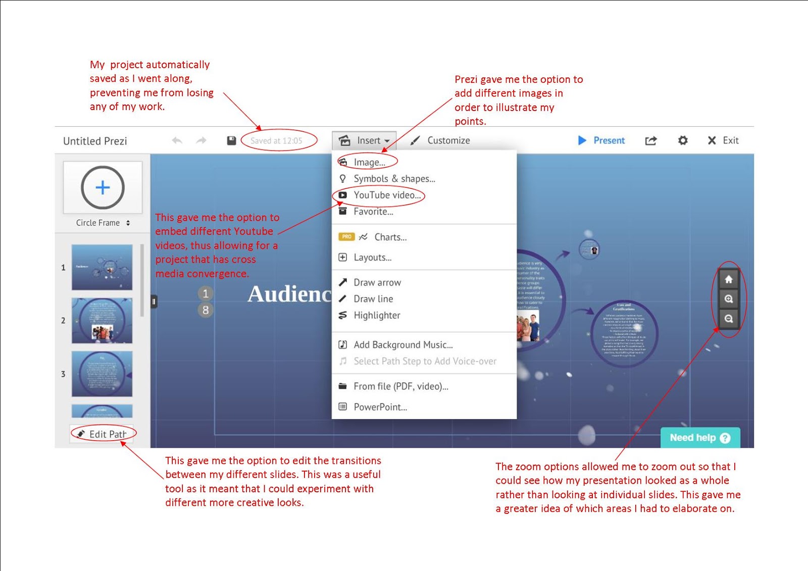
Prezi
Prezi was an alternative way for me to present my ideas, rather than simply sticking to static slides which can get boring. Its large variety of templates meant that each presentation was personalised and added a bit of character. The interesting transitions keep the presentations interesting visually and take the viewer on a journey. Below I have labelled some of the features that I found especially useful...
Surveys
 |
| Our survey results |
 |
| An example of feedback I recieved Once again, Whatsapp also came in handy at this part of the process as it allowed me to quickly and easily send out a link to our final video to people in my contacts. This was especially helpful as my friends are all within our TA age range, meaning that I was able to get their opnions directly. Once they had watched our video I was able to ask them questions such as "Did you like the video?" and "What would you change?". The feedback that I recieved, (an example of which can be seen above) proved to be very useful as it was very specific and relevant considering it came from people within our TA. |
 |
| Sam's shocked reaction |
 |
| My edititing screen |
To conclude, this project has opened my eyes to the large array of technologies that are so easily available to my generation. It has given me a new found appreciation for these resources and has stimulated my creative mindset. I personally feel more confident using many of these new technologies and will continue to use them in the future.
Monday, 19 December 2016
Construction Post 6: Website Post Production
We used the software Wix in order to create our website. Although this is a software I had not previously used, by the end of this process I am very confident using it and its tools. A website is very important for an artist as it acts as a hub for all of the information about them. In addition to this, we wanted our website to be an interactive place where fans of our artist could find opportunities to get involved in activities as well as view exclusive content.
In order to stick to convention we wanted to create a landing page. After researching into other artist's websites I decided that I would use our artist's album cover as the background for this page. This would immediately advertise our new album to any viewer of the website, increasing our reach to our TA and therefore increasing the likelihood of sales. Other artists such as Alicia Keys have also used this technique which I think is very effective...
 |
| Alicia Key's landing page |
 |
| Our landing page |
Once the viewer enters the site via the 'continue to site' button, they are navigated to the home page. Here, they are greeted by a compilation of short clips that I sourced from outtakes which were later edited by Jerom. We were inspired to do this by looking at the sites of artists such as Izzy Bizu and Drake who have videos that automatically play in their background. This appealed to us as it was immediately engaging and showcased the artist. The button 'Listen' links to our music page, once again advertising our new album.
 |
| A snippet of our home page |
 |
| A snippet of Izzy Bizu's homepage |

We were also told that our social media icons blended in to our footer too much as they were originally black, so I changed the theme to one that stood out more in order to encourage viewers to click on them. Having social media was very important to our artist as it allows them a way to interact with their audience. For this reason, I created an Instagram account for our artist. Having different social media platforms meant that we could broaden the reach of our artist as well as offering fans exclusive material. This is also a good example of cross media convergence as the website is able to advertise and link to all of these different media texts.
Next, I created the Music page. Here I put the finished music video along with an album track. The album track once again showcases the album cover, creating a consistent image, whilst the final music video creates new imagery. Below the final music video I wrote a quote that the artist would have said about their new album. This helped to give the website a more personal feel, increasing the audience's ability to relate to the artist.  |
| The Instagram account I created |
 |
| Our music page |
 |
| Gallery pictures |
Below this, I created an exclusive behind the scenes video which can only be seen on the website, acting as an incentive for fans to go on the website. This short video can be seen below...
I then created the 'News' element of this page. Here, fans could keep up to date with any events that Layla Obi had. For example, I created a competition in which fans had the opportunity to meet the artist if they entered a competition by using the hashtag #MeetLaylaObi. This made our website more interactive for the viewer as well as encouraging them to advertise our artist further through the use of the hashtag. As Andrew Dubber once said, "Today a music website is a place where people gather and connect with an artist and with each other." and so by encouraging our fans to share posts, we will be creating an online community for them to connect through.
 |
| Our competition |
 |
| The button gadget |
 |
| How I linked the buttons |
The next page I made was the Merchandise page. In order to make our merchandise options more interesting I created a variety of products such as a phone case, a mug, a beanie and a backpack by duplicating the brand template that Matt had created onto different items. This helped to create a larger ranger of items which is beneficial from a marketing perspective as the more options a consumer is given, the more likely they are to find an item that they like and eventually buy.
 |
| Our Merchandise page |
I then combed through this page, adding little details such as product information and shipping details so that our site was more informative and appeared more realistic.
 |
| Product details |
The 'More' section consists of the pages 'Bio' and 'Sign Up'. Here, extra information about the artist as well as the option to sign up to the website mailing list are presented. For the Bio page I created a backstory for our artist. This is so fans could find out as many details about our artist as possible in order to fulfill their want to know more about idealised figures. As well as this, I created a Q and A in which the artist answered more questions about herself.
 |
| The bio I wrote |
The sign up page gave the viewer the option to create an account with the site, allowing them to receive any information regarding Layla Obi.This is important as it means that we can directly interact with fans and increases our reach.
 |
| Our sign up page |
Overall, I am very pleased with how the website turned out as I believe that I created one that was both informative and interactive as well as aesthetically pleasing.
Subscribe to:
Posts (Atom)