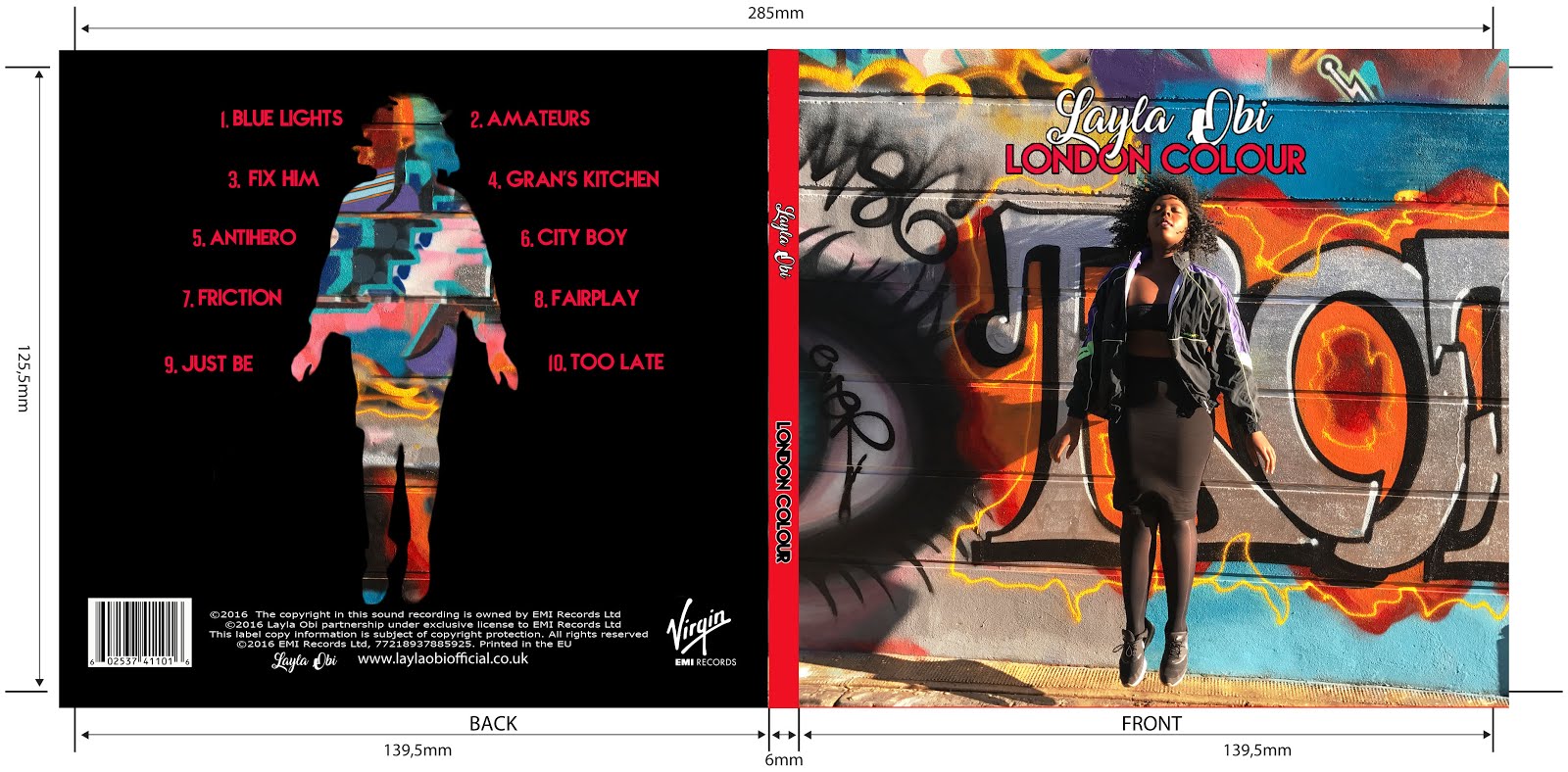
During our planning we have been collecting different ideas for possible album covers. This has included looking at already existing album covers and seeing which we found to be effective. For example, we were heavily influenced by artists such as Amy Whinehouse due to their use of movement. We felt that this was very effective as it made the image appear like it was a snippet of a story and made me want to find out more. In response to this, we also wanted to created an album cover that used movement and came up with ideas in order to achieve this...
 |
| Our plan for digipak panels |
The top left section of this flat plan is our planned album cover. It depicts the artist Layla Ade mid air in front of a background, We decided that we wanted a graffiti background in order to give a grungy and street feel to our album, so went looking for locations that we could possibly shoot this. We eventually picked the are of Shoreditch and found some colourful graffiti which we felt would be fitting for our album cover.

The top right corner shows our plan for the back cover of our album. It shows a silhouette of Layla, made out of graffiti, surrounded by a black background. We were largely inspired by the artist Pell's art work as we felt that it was very effective and aesthetically pleasing.
The bottom left corner is our plan for our left inner panel. This is a profile shot if Layla with hand written notes and memos surrounding her. We felt that this stuck to the graffiti lexis of our album, whilst also adding a personal touch to it. It also reveals vital information about our artist to the audience which is essential, especially in a debuting artist.
 |
| Our planned panel |
We wanted the bottom right panel to be a 'candid' picture of Layla. We went on location to practice different poses for this shot, however, we came to the conclusion of the one drawn as we felt that it highlighted the desired 'candid' nature of the shot, whilst also meaning that the artist will not be completely masked when the physical CD is placed in its case.
 |
| One of our practice shots |


No comments:
Post a Comment