After shooting our final album cover we began editing our panels. This was a crucial aspect of our project as album art is very important, especially for a debut single as it defines an artist and represents who they are.
Inside Panels
After our shoot I reviewed our pictures and decided on the images that we would use.
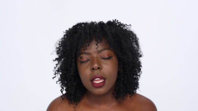
Originally, our idea was to include a side profile shot of my face with writing around my face on the left hand side panel. However, after viewing the pictures taken I decided it would be best for them not to be included. Instead I had to use my resources and decided to create a new focal image by taking a screenshot of one of our behind the scenes videos.
 |
| The behind the scenes video I sourced the photo from |
 |
| The image I created |
As it was a screenshot, it meant that I had to edit this picture in order to appear cleaner. For example, in the image above it is clear that my eyes are still slightly open. In order to stop this I used the paint tool on Photoshop to paint over this space so that my eye looked closed.
 |
| The edited version with my eyes shut |
I then went on to use refine edge to cut my head away from the background. After I did this I increased the brightness of the image so that it blended into the white of our panel more.
 |
| The cut out head before adding the background |
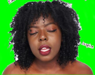
Originally Matt had attempted to source a font to recreate the look of handwriting, however, I felt that this didn't look effective so I suggested that I write out the words and sketches by hand. After I drew all of these words Jerom used the Polygonal Lasso tool to select each word individually, then moved them onto a white layer. After this, he turned up the contrast in order to make them darker. Coming up with words to go inside of the panel was difficult for me at first, however, after referring back to our influential album covers such as the one for the artist Erykah Badu, it reminded me that the words did not have to necessarily make logical sense together but needed to individually evoke our artist and their character. This lead me to include phrases such as 'Make a change' and 'Keep up'. We also wanted some drawings that represented our artist and her beliefs. For example, I suggested that we included the symbol of a fist as it is often associated with black pride. Jerom then went on to draw this image along with some other sketches so that he could strategically place them around our panels.
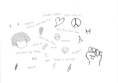 |
| Some of the phrases I wrote |
 |
| The font that was previously on our panel |
Outside Panels
After taking our album cover picture we wanted to increase the brightness of it so that the colours popped and connoted energy and youth. Jerom used the levels function on Photoshop in order to do this and created an image which made the grafitti background stand out more.
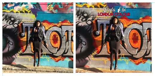 |
| Before and after the colours were edited |
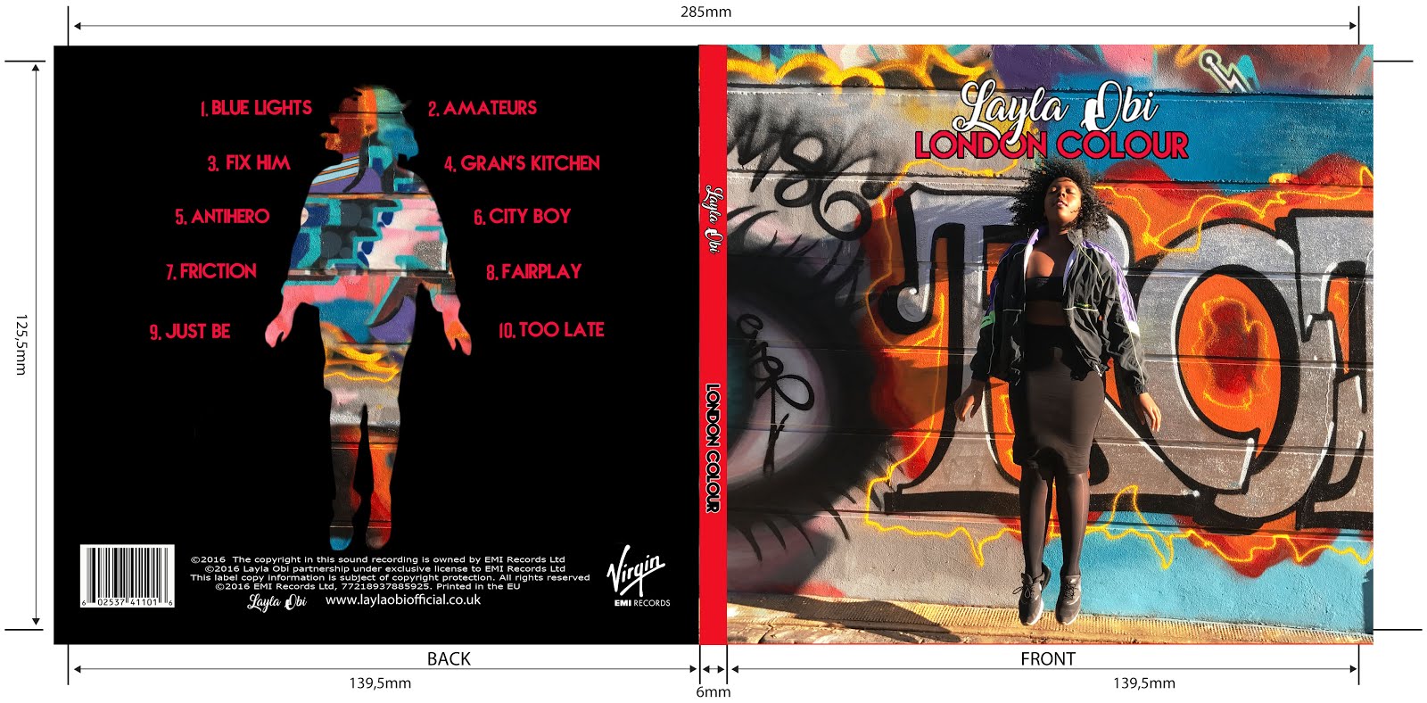
As we had discovered whilst editing the interior of our album, my silhouette proved to be very difficult to edit around. This was due to my hair as its volume and intricate texture meant that it took a very long time to refine the edge of this image. After successfully cutting around my body from the front panel image, it was duplicated and transferred to the back panel of our template.After this, my body was layered with an image of graffiti which was extracted form the cover. However, after seeing this effect we decided that it would be best if the back panel showcased a different type of graffiti. In order to achieve this, Jerom and Matt used the Clone stamp tool along with the Polygonal Lasso in order to manipulate the image and colours of the graffiti that we already had, creating a different and vibrant look.
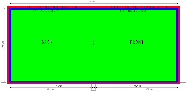 |
| The template that we used |
It was important for us to stick to the conventions of album covers when we were deciding what information to add to the back of our album in order to provide audience members with the relevant information. After researching existing albums, we decided that we needed to include a bar code, a copyright claim, an institutional logo, the artist's logo and the artist's website.
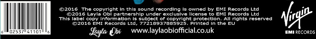 |
| The information on our album |
It was difficult to decide on the sizing of the name of the artist on the album cover at first as we wanted it to be striking, without overpowering the image and drawing away attention from the focal image which is the artist themselves. However, after seeing albums from artists such as Beyonce and Adele, it became clear that their names had to be bold as they acted as part of their brand and were just as important as the title of the album. After this discovery, I suggested that we increased the size of the name 'Layla Obi' so that it became the focal point of all the writing. However, after doing so the two separate layers of name and album title overlapped each other. In order to prevent this i suggested that we somehow incorporated the two through techniques such as putting the letter 'y' in Layla through the 'O' of London. With the help of our technician, Emma, we discovered a way to do this by using the Polygonal Lasso tool on Photoshop.
 |
| Our album's final title |
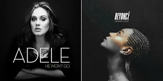 |
| Adele and Beyonce's albums |
In conclusion, this process required a lot of trial and error as we experimented with many different effects and formats in order to bring out the best results. Through this section of the project I also developed my knowledge of Photoshop tools and utilised my group's artistic abilities.


No comments:
Post a Comment