My name is Olamide Ajisafe. My candidate number is 8010. I am in a group 3 with Jerom Thambipilliai (8692) and Matthew Davies (8511). To see my work, please click on the 3 labels on the right named A2 Research and Planning, A2 Construction, and A2 Evaluation.
Below is our finished music video...
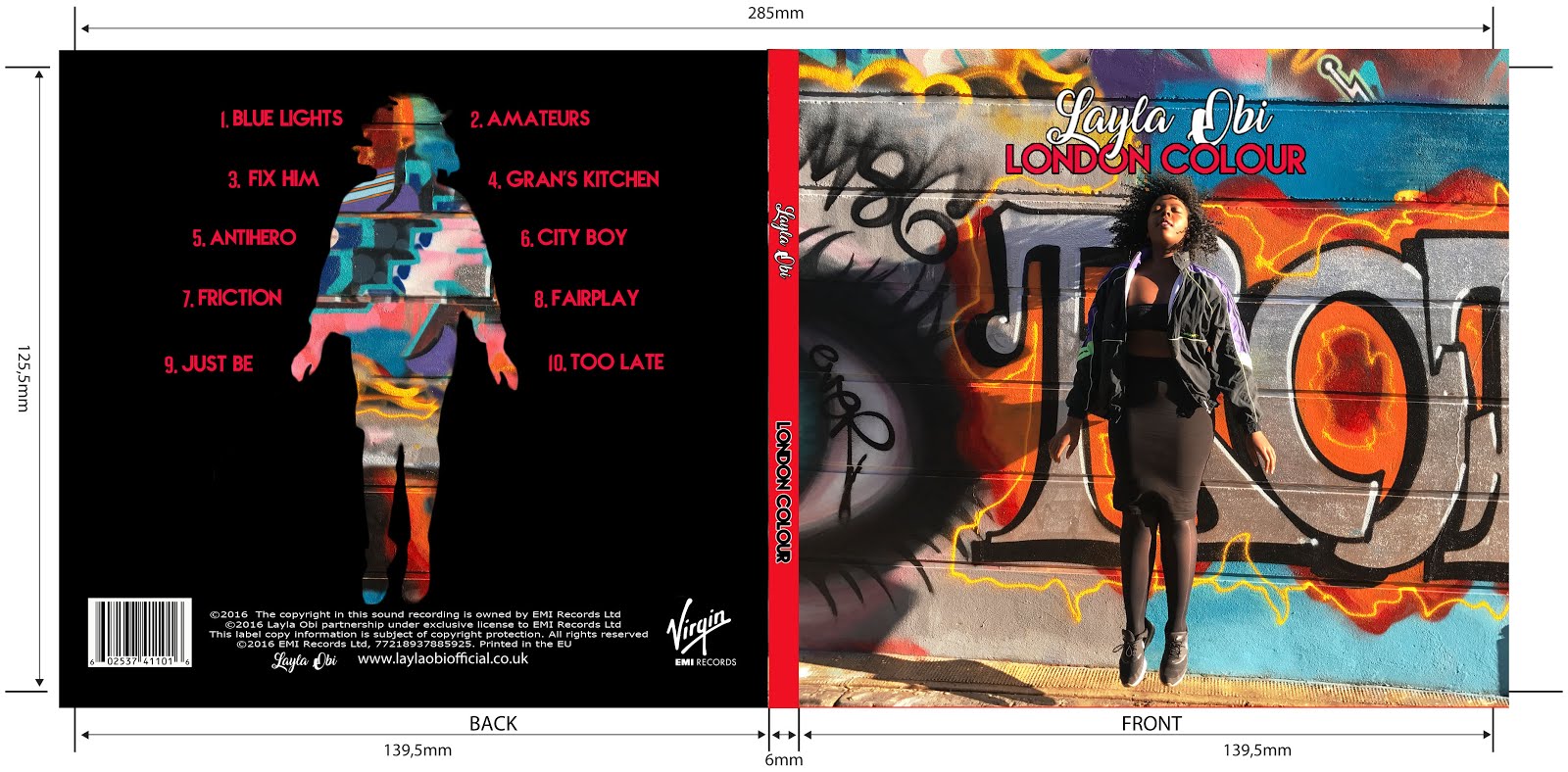
Below are the external panels of our Digipak. Left is the back and right is the cover
Below are the external panels of my Digipak

Left is the back of the album and to the right is the front
Below are the internal panels of our Digipak
Below are the internal panels of our Digipak
Below are the internal panels of our Digipak

Tuesday, 29 March 2016
Closing Post
This blog is now closed and I will no longer be posting. I hope that you enjoy reading my blog!
Thursday, 17 March 2016
Evaluation Question 1: In what ways does your media product use, develop or challenge forms and conventions of real media products?
Our film is called 'Aglet'. It is a British Indie film that follows the life of a homosexual teen on a journey to find himself, whilst also stumbling across love on the way. Our film opening adheres to many film conventions in order fulfil the audience's expectations, however, we also challenged some of these elements in order to create a more unique and interesting opening sequence.
Form
An example of a film that has also used these elements of form is 'Fish Tank'.
In the opening sequence we are immediately introduced to the main character and wonder what she has done to make her breathe so heavily. This heavy breathing also helps to create suspense as it is the only sound and creates a very uneasy atmosphere. Although we do not see her, we are also introduced to the character of 'Ki' over the phone who we assume is a close friend of the protagonists very casual talk towards her. From this phone call we also learn that the protagonist is a seemingly violent person due to her use of harsh words such as 'bitch'. We are introduced to the setting which appears to be a council estate. This automatically has negative connotations for both the area and the character as she is assumed to be a 'chav' stereotype which is later confirmed in the film. Suspense is built at the end of the sequence as we wonder why she has gathered rocks and what she will use them for.
Genre
For our film we chose to incorporate the genres of British indie, Coming of Age, Comedy and LGBT.
British Indie:
 |
Coming of Age:
Comedy:
| The punch |
LGBT:
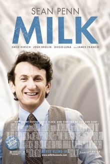
 We demonstrated the conventions of this genre through our use of gay characters. Our protagonist is homosexual and we follow him on a journey as he struggles to accept himself. We deal with issues that member of the LGBT community may be able to identify with such as bullying which occurs in the opening sequence. This makes the film more realistic and relatable for members of the LGBT community, whilst also making our film highly educational for those that are not part of this community. Other films such as 'Milk have also showcased a homosexual protagonist who strugglesto find acceptance due to is sexuality.
Narrative Structure
In our film we chose to stick to the 'classic' narrative pattern which adheres to Todorov's theory...
We also included some of Roland Bathe's theories...
Enigma code:
This code poses questions to the audience which are answered later in the film. For example, the audience constantly questions what Craig is writing in his notebook and why he is doing this. However, we also somewhat challenged this code through our use of a voice over which answers some of the questions raised.
Cultural code:
Associations on narratives may be made be people's previous experiences. For example, due to the bullies' stereotypical 'chav' costume, the audience may assume that they are loud or aggresive.
Action code:
An action which moves the narrative in a particular direction. For example, when the bullies walk past Craig as he sits quietly on the bench. The bullies then become the main focus of the narrative.
Symbolic code:
Suggests that images in narrative can have different purposes or meanings. In our opening sequence we use Craig's notebook to suggest his shy and antisocial nature.
We also integrated some of Levi Strauss' Binary Opposites theory. We achieved this through our choice of character. Craig is a very quiet, social awkward teen who contrasts greatly to the very loud and aggressive bullies which he confronts. Craig is portrayed as the victim, whilst the bullies are portrayed as the villain. However, Craig may also be seen as the hero as he confronts the 'bad guys' in order to help out a fellow victim. It is not conventional to mix these portrayals within singular characters, however, we chose to do so as we felt that it would add an element of realism to our sequence.
Style
We have attempted to connote our chosen genres through our specific choices in style.
Sound:
 We used an acoustic guitar cover of the song 'Let it go' by James Bay as our soundtrack to suggest the indie nature of the film, whilst also increasing the pace of the sequence due to it being upbeat. We were inspired by the music used in the film 'Submarine' as they chose to use a very mellow guitar track with gentle vocals which we believed set the mood of the film very effectively.
We also chose to include a voice over within our sequence. This meant that our main character, Craig, could speak directly to the audience, thus heightening the audience's ability too submerge themselves in the film. It also means that the audience may understand Craig more as they are given a unique perspective in his mind. Other films such as 'Me, Earl and the dying girl' have also used a voice over for this effect.
Grading:
 |
| Grading in Juno |
Titles:
After looking at other British Indie films such as 'Fish Tank' and 'Submarine', we noticed that they both used a rectangular frame as a guide for the writing on their titles. We felt that this was very effective as it gave them a neat and organised look which we also wanted.
 |
| Submarine title |
 |
| Fish Tank title |
 |
| Aglet title |
We used the font 'Songs for Jennifer' as it has a scrapbook feel to it which we felt was suitable for our film, given Craig's attachment to his notebook. This 'hand drawn' type of look has also been used in films such as Juno and give the titles a very unique look. We also felt that it helped to suggest our TA (target audience) as it looked more youthful and fun. This idea was also reinforced by our use of the colour bright blue. We also used lower cased letters within our titles as a way to break the conventions of titles, whilst also making them look more interesting.
 |
| Juno's use of Cartoon font |
 |
| Our use of scrapbook-like font |
Camera work:
In conclusion, we adhered to many film conventions so that our film could be easily understandable, however, by challenging some of the conventions we have made our sequence unique and therefore more entertaining.
Labels:
AS Coursework
Subscribe to:
Comments (Atom)


